Building Dark Mode in React: The Fun Way
King Somto
26 Nov 2021
•
5 min read
Dark mode is a common feature seen in most sites in the past few years. It's a cool convention where the default white backgrounds and bright colours are changed to different colours, making the page appear in a darkish tone, most people prefer it because it's easier on the eyes.
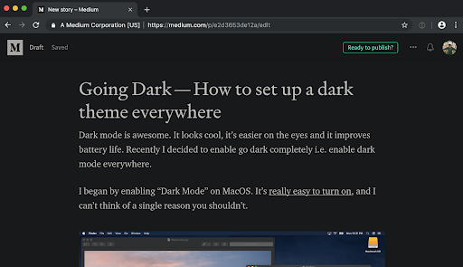
A cool example would be companies like Google, Youtube, Stack Overflow, and Medium that implement the option of dark mode.
How to get Dark Mode in a React app
This tutorial will be focusing more on the concepts of building it into the react applications, rather than how to use libraries like styled-components or explaining deeply functions like React.createContext.
Why is Dark Mode so awesome?
Apart from its aesthetics, the dark mode has advantages which come in pretty handy for most users.
-
Saves battery Dark mode has been proven to reduce up to 58% of the power drain from the battery compared to the normal mode.
-
Easy on the eyes It may not be confirmed if dark mode can help the eyes but it for sure can reduce the strain on the eyes. It's also more comfortable to read at night.
-
Looks amazing 😍 Dark mode simply makes your app look cooler and giving users the feeling of using a new app when trying out the dark mode for the first time.
The Tech
For this example of building dark mode into an app, we would be assuming that you have a basic understanding of React. If you don't, it's quite easy to learn, you can try it by checking this tutorial. Note that in this project we will make use of basic react technologies, meaning no libraries, so it will be easy to understand.
CSS Variables
CSS variables are custom properties defined and set up by the developer and can be accessed throughout the project eg --main-background, these variables can be accessed using the CSS command var() and an example of the usage would be background:var(--main-background).
Setting up
Working with react follows very simple and straightforward steps:
- Downloading the template
npx create-react-app darkmode
- Navigating into the project and running it
cd darkmode
npm start
React CreateContext
CreateContext is a function provided in React that helps you create a context that can be shared among children components in the react app. This is how we can notify every component that the mode has been changed and it would need to re-render the style.
Implementation
To create the component we need to create different components to perform an individual task.
Context Provider
This will sit on top of all the components, it checks to see if the browser has already had a mode set and notify each component that the mode has been switched.
Global theme styles
This file contains all the colours used in the application, we do not hardcode any colour, all the colours used in the app are stored here.
Toggle Function
This toggles the app between dark and light mode.
Writing code (Finally)
The first step would be to create the globalstyles file.
Run
cd src && touch globalstyles.js
Now a new file has been created add the following code:
export const lightTheme = {
navTextColor: # 000",
background: # fff",
};

export const darkTheme = {
navTextColor: # fff",
background: # 000"
};
Creating the context provider for the application
The context provider sits above all the components and can share the state with all the children components. This is how we would pass the toggle function to the component and also the current mode we are on.
We are going to set the CSS variables of the application from this point by using a document function called setProperty an example would be
document.body.style.setProperty(`--background-name`, `pink`);
The code
import React from "react";
import { darkTheme, lightTheme } from "./globalstyles";

const themeColours = {
light: lightTheme,
dark: darkTheme,
};

const ThemeContext = React.createContext();

export const ThemeProvider = ({ children }) => {
const [themeName, setThemeName] = React.useState("light");

 ///adding code here
return (
  <ThemeContext.Provider value={{ theme: themeName, setTheme }}>
    {children}
  </ThemeContext.Provider>
);
};
export const useTheme = () => React.useContext(ThemeContext);
Let’s break the code down
import React from "react";
import { darkTheme, lightTheme } from "./globalstyles";
Here we import the styles we defined earlier in the globalstyles.js
const ThemeContext = React.createContext();
Creating our context to serve as a root parent component to save state and share it among children components.
const [themeName, setThemeName] = React.useState("light");
Creating our states to store our theme and themeName, the setThemeName is used to set the name of the theme mode.
return (
  <ThemeContext.Provider value={{ theme: themeName, setTheme }}>
    {children}
  </ThemeContext.Provider>
);
Returning the component, we pass the themeName, setTheme function which can be called by children components.
Now let's make some edits that would help us set the CSS variables programmatically
import React from "react";
import { darkTheme, lightTheme } from "./theme";

const themeColours = {
 light: lightTheme,
 dark: darkTheme,
};

const ThemeContext = React.createContext();

export const ThemeProvider = ({ children }) => {
 const [themeName, setThemeName] = React.useState("light");


 ///get the defined mode from the browser
 React.useEffect(() => {
   const darkOS = window.matchMedia("(prefers-color-scheme: dark)").matches;
   setTheme(darkOS ? "dark" : "light");
 }, []);

 const setTheme = (name) => {

   ///turn my configurations to css variables
   const keys = Object.keys(themeColours[name])
   keys.map((key)=>{
     const constructVar = `--${key}`
     document.body.style.setProperty(constructVar, themeColours[name][key]);
     return false /// cuz eslint just wants me to return something
   })

   setThemeName(name);

 };
 return (
   <ThemeContext.Provider value={{ theme: themeName, setTheme }}>
     {children}
   </ThemeContext.Provider>
 );
};


export const useTheme = () => React.useContext(ThemeContext);
Now our Context provider is able to set the CSS variables dynamically just by calling it and passing in the name of the mode.
Now let’s got through the changes made
 ///get the defined mode from the browser
 React.useEffect(() => {
   const darkOS = window.matchMedia("(prefers-color-scheme: dark)").matches;
   setTheme(darkOS ? "dark" : "light");
 }, []);
Here we check the system/browser if the dark mode is the default theme selected by the user, and use that to set the initial theme or just use the light theme.
const setTheme = (name) => {
  ///turn my configurations to css variables
   const keys = Object.keys(themeColours[name])
   keys.map((key)=>{
     const constructVar = `--${key}`
     document.body.style.setProperty(constructVar, themeColours[name][key]);
     return false /// cuz eslint just wants me to return something
  })

  setThemeName(name);
};
The set theme function is created to set all the CSS variables defined in the globalstyles.js depending on the style mode (dark | light) of the app. The function turns the JSON object to CSS variables by taking the keys of the object and putting them in an array, iterating through them, and using that to set values. This function is called anytime the theme is switched to set the CSS variables according to state.
Creating our CSS
Let’s create our CSS file.
Run
touch index.css
Now a new file has been created add the following code
body{
background:var(--background);
color:var(--navTextColor);
text-align: center;
}
button{
background:var(--background);
color:var(--navTextColor);
}
Here we define our CSS module, notice the use of the CSS variables in the file, the values in the variables are changed when the style mode is updated.
Putting it all together
Creating our Context Provider and our CSS module has been a breeze, now we get to put everything together and see how our project works
Now let’s edit our App.js and type in
import { useState } from "react";
import { useTheme } from "./utils/themeContext";
import "./index.css";

const App = () => {
 const { setTheme, themeName } = useTheme();
 const [mood, setMood] = useState(themeName === "dark");

 return (
   <div>
     <button
       className="fab"
       type="primary"
       onClick={(e) => {
         setTheme(mood ? "dark" : "light");
         setMood(!mood);
       }}
     >
       {" Toggle d theme"} <p>{mood ? "dark" : "light"}</p>
     </button>
   </div>
 );
};

App.prototype = {};

export default App;
 const { setTheme, themeName } = useTheme();
 const [mood, setMood] = useState(themeName === "dark");
Here we initialize the variables needed, we use useState to store the theme mode
    <button
      className="fab"
      type="primary"
      onClick={(e) => {
        setTheme(mood ? "dark" : "light");
        setMood(!mood);
      }}
    >
      {" Toggle d theme"} <p>{mood ? "dark" : "light"}</p>
    </button>
Passing setTheme in the onClick function, we pass in the theme name in the setTheme function and that triggers the context provider to change themes this redefines our CSS variables.
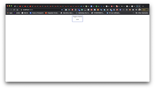
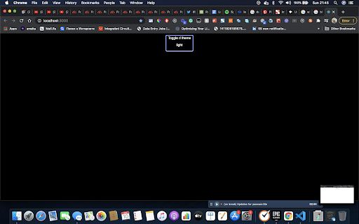
Finally, we have an output
Light Mode

Conclusion
Adding the dark mode to the app is a simple process. We use our globalstyles file to keep track of the colours and they are never hardcoded in the app, this lets them be dynamic.
There are other ways to implement this and you can play around with it using tools like Redux and Reacts useReducers.
Happy coding!
WorksHub
Jobs
Locations
Articles
Ground Floor, Verse Building, 18 Brunswick Place, London, N1 6DZ
108 E 16th Street, New York, NY 10003
Subscribe to our newsletter
Join over 111,000 others and get access to exclusive content, job opportunities and more!


